Is it really true that beauty lies in the eye of the beholder? Can beauty be universally defined? Is beauty relative or absolute? There are many indications that beauty in nature exists separate from the individual‘s perception - it is far less subjective than often thought. In nature everything makes sense: But what sense lies in beauty, what function does it have? According to evolutionary theory all matter strives towards perfection. Is beauty therefore a motor for development, a necessary wheel in the clockwork of nature to reach perfection? And why are we so fascinated and addicted to beauty? Why do we blindly follow in its wake? Could a greyer, duller world not be acceptable? Whatever intelligence is behind creation it could have also created it with a bit more pragmatism. To be honest functionality does not need beauty, the world could have functioned on logical principles without any beauty included. So why does beauty exist? And why does it count so much in our lives? One explanation might be that beauty is not a method for development but part of the intended perfection. Beauty is universally objective, beyond the human. Symmetry and the golden section are a given and are as much a part of nature as gravity or acoustic waves. Of course personal factors always play an important role as well when speaking about beauty. Everybody has his or her own tastes which makes beauty quite subjective. What someone defines as beauty depends on a person’s biography, social surroundings and biological abilities. A color-blind person sees the world differently than someone who sees every tiny nuance of color. Someone who always wears tailored suits might have a problem with torn jeans and t-shirts.
Ideals of beauty vary. But if we can set aside our personal preferences we can find a common denominator. And then why not take taste into consideration.
In everyday life the creativity of industrial designers is curtailed by definite limits. For a start form follows function only to a certain degree; the second barrier is the manufacturing process. But let us put that aside for a bit and focus on aesthetics.
What are the elementary rules?
Detailing similarities.
The composition of a new design is like creating a visual form of music. If the designer can connect the single notes it becomes a harmony. The same applies to optics. Human visual perception functions according to the following principles: Our eyes are constantly sending new information to our brain, this flood of stimuli is sorted and important and unimportant facts are separated. Without this filter our brain would be hopelessly over-saturated – as would we.
Information that has been filtered is then sent to a so-called ‘database of memories‘ where it can be cross-referenced with information already stored there. We understand a seen object and a copy of its form emerges before our inner eye. What we see therefore is not reality but a reproduction of reality.
The more easily our brains are able to analyze a form, the more pleasant and enjoyable the experience of the analysis. Too many details, bad proportions and unfamiliar forms make this procedure far more difficult and can make objects appear disharmonious and awkward. But if the brain finds logical coherences in a form and is not strained by too many unnecessary details, reconstruction becomes easier. The object seems more harmonious and we have greater pleasure looking at it. It is logical and optimal to reproduce an object in a way our brain can easily comprehend.
At this point it is worth looking more closely at the measures that need to be taken to develop harmonious design:
The fewer different forms the better.
The visualization of a product is facilitated if and when the same radius is used every time, the same operating elements are present and other similar factors are present.
Relieving the brain.
When looking at an object your brain automatically analyzes the mathematical proportions of the various components whether you like it or not. The composition either feels elaborate, the division of lengths and distances harmonious, or not. Consistent proportions therefore do not please the eye but the brain.
The golden section.
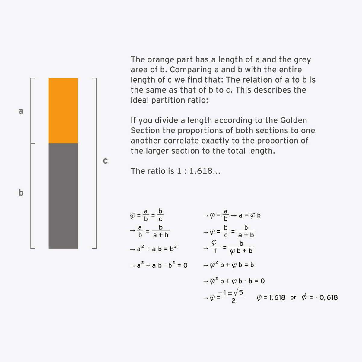
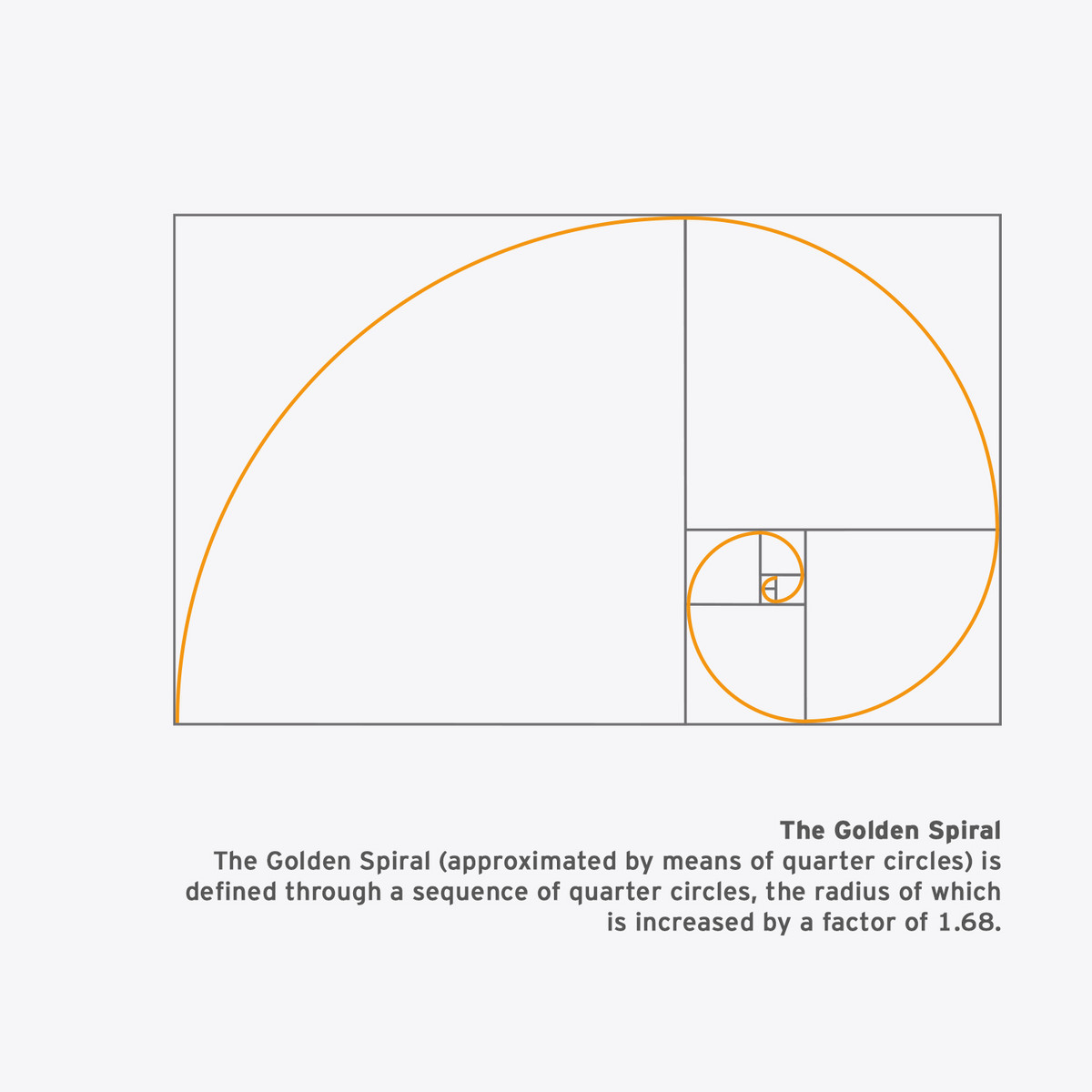
Finding the ideal formula for setting forms together in harmony has occupied mankind since time began. That this quest is worth it can be seen, amongst other things, in the Golden Section.
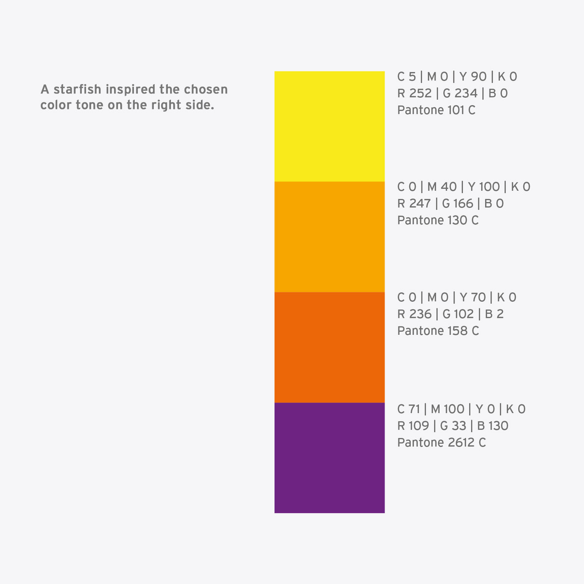
As early as circa 300 BC the Ancient Greek mathematician Euclid of Alexandria outlined the principle for the first time. A Franciscan monk with the impressive name of Luca Paciola di Borgo San Sepolcro characterized the Golden Section as a godly division. The first concrete description of it was made by professor Michael Maestlin in Tübingen: In 1597 he defined it in a letter to his former student Johannes Kepler as approximately 1.6180340. To bring a bit more color to the rather dull theory please imagine the task is to color a set of bars in two different colors, one part in orange and the other in grey.
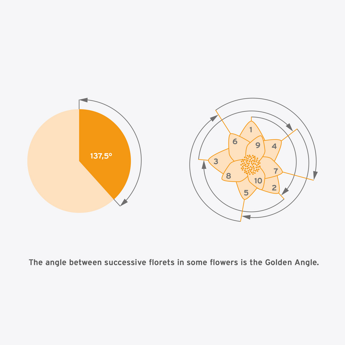
The Golden Angle
The Golden Angle is obtained when the circumference of a circle is divided according to the ratio of the Golden Section. The subsequent angle measures 137,5° and is designated as the Golden Angle. As you move around and use the Golden Angle in rotation, you will reach new positions every time that are relatively proportioned. This effect occurs because you cannot divide a full circle of 360° by portions of 137,5°. If you keep adding on portions, the result will be an offset pattern. Those patterns you see in nature and only nature are proof that the Golden Angle is imbedded in LIFE.
Keeping Order “behind the scenes”.
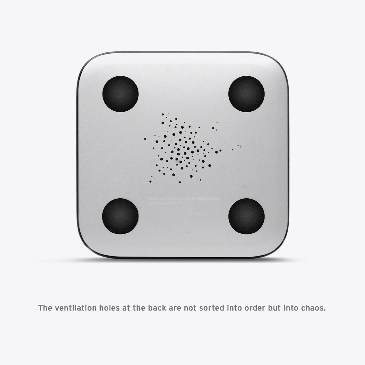
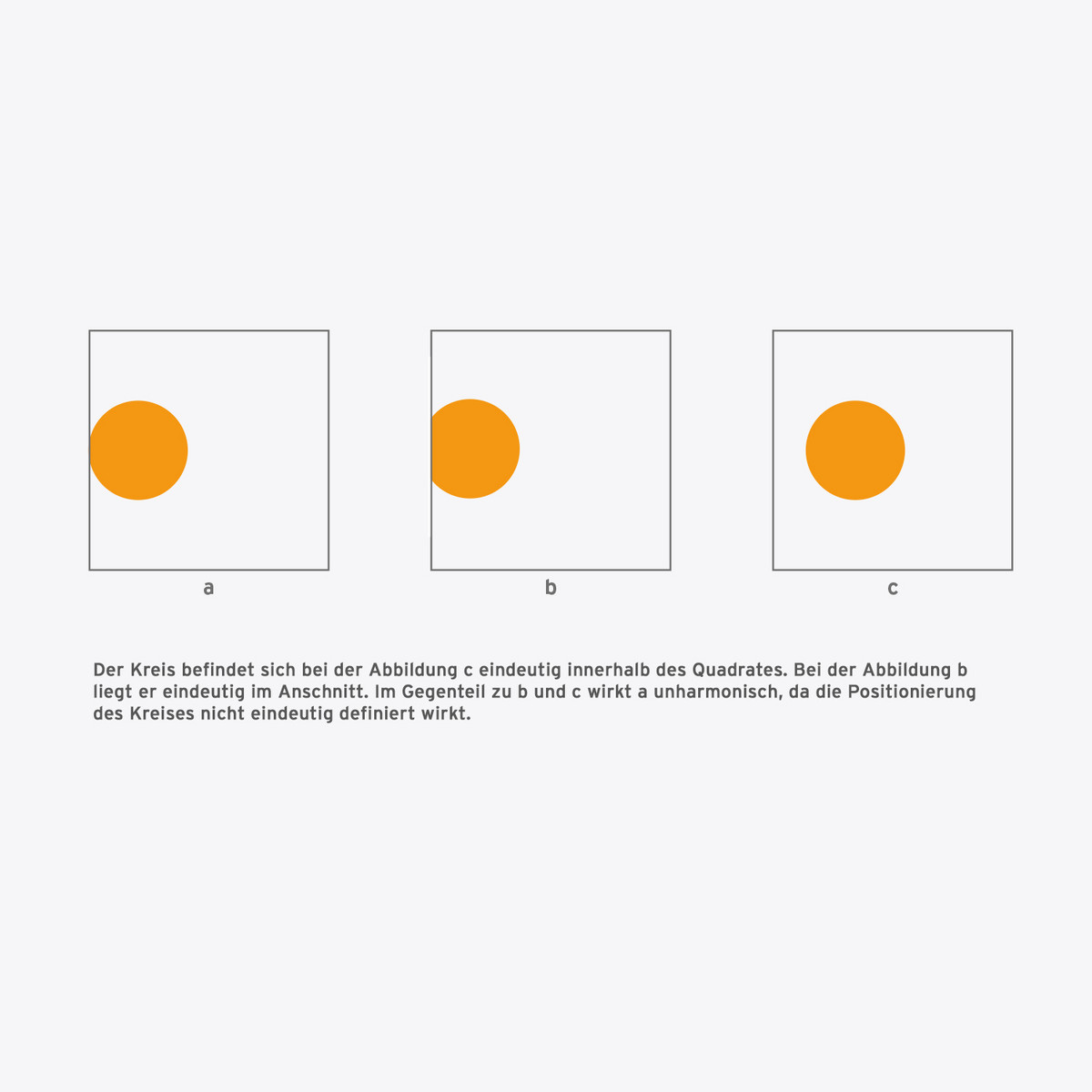
All elements in design are oriented towards an invisible layout grid so that their allocation leads to a harmonious overall impression. Next to the visible elements like displays, control knobs or vent holes, imaginary objects like circle centers or outer line extensions are subordinate to a layout grid. This is not only positive for a product‘s look but also for its usability, as a clear structure in design is easy to grasp and use intuitively. Most often a quadratic space is used for the layout grid, so the elements are adjusted horizontally and vertically. Beyond this there are further possibilities: instead of quadratic grids, those divided into triangles offer great new opportunities for arranging the elements. Even circular grids and grids based on geometrical algorithms are possibilities.
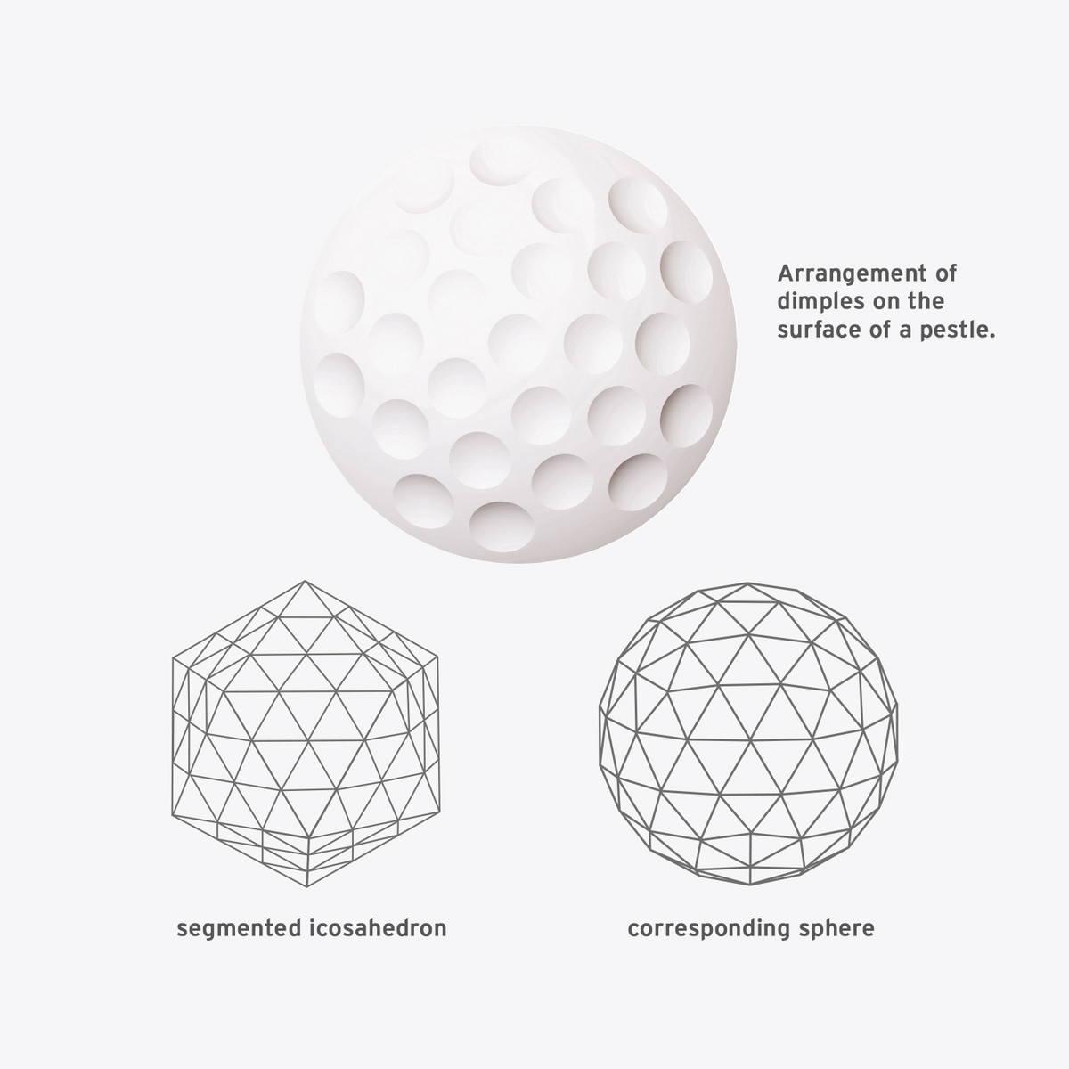
Der Ikosaeder gehört zu den platonischen Körpern und eignet sich optimal für eine geodätische Kuppel (Konstruktion einer sphärischen Kuppel mit einer Substruktur aus Dreiecken). Alle Eckpunkte des Ikosaeders liegen auf der Oberfläche einer Kugel. Die Anordnung nach dem Prinzip eines Isokaeders ermöglicht eine gleichmäßige Verteilung der Dimples.
Less is more.
Design elements without any useful function normally have no reason to exist. Unnecessary things distract our brain from the essentials. Needless details often reflect the zeitgeist and can look dated after the event – like pop singer outfits from the 1980‘s.
In short: Minimalism is the best policy.
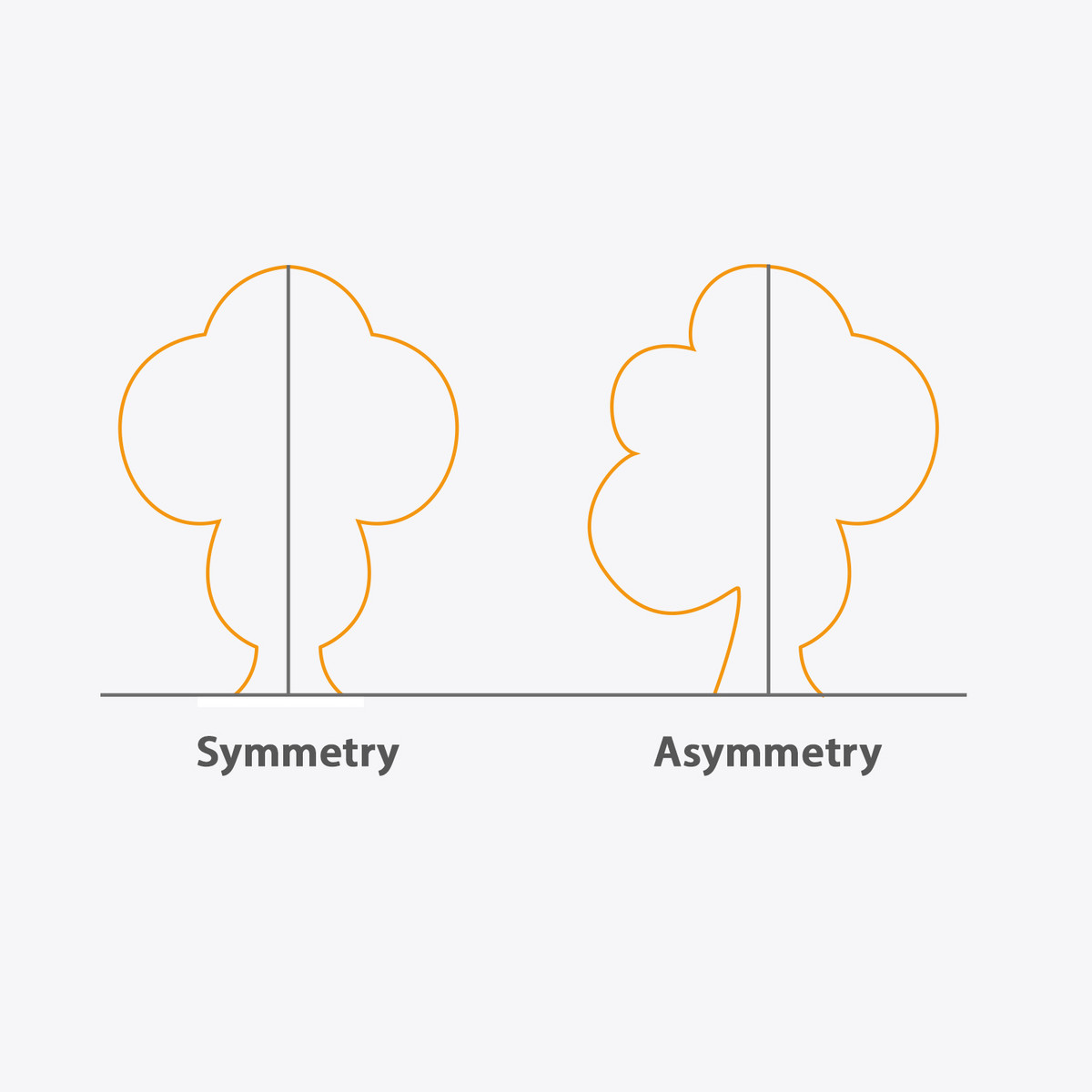
Sometimes it is better to do things in halves. With a symmetric design the brain only needs one half of the picture to puzzle the complete one together: A design like this is simpler to grasp. Butterflies, sunflowers, and even human beings are all to a certain point structured symmetrically. The noun “symmetry” describes the ability of geometrical forms to depict themselves on their own. Originating from the Greek word symmetría it means something like harmonious relationships, proportions. Due to its regularity the eye can take in a symmetric form more easily, and that is then more relaxing for the viewer. Symmetry can be created in different ways, in a two dimensional area axial and radial symmetry have to be differentiated.
Axial Symmetry
This variation is also called mirror or reflection symmetry. On a symmetry axis both parts of a form can be mirrored; Both parts are congruent. Capital letter A for example is symmetrical: If one divides the letter in the middle from top to bottom and folds one part over the other one can see: Both sides of an A are identical.
Radial Symmetry
In nature, flowers are a good example of radial symmetry: Around a point, the so called centre of symmetry, the same forms are mirrored at certain intervals. The petals of flowers are adjusted symmetrically around a centre – providing they have not been removed by someone looking for other answers: “She loves me, she loves me not, she...”
Symmetry creates interesting patterns. Adding forms to symmetrical systems creates a variety of patterns, also called tessellation.
Asymmetry, as indicated by its name, is contrary to symmetry; an asymmetrical form cannot mirror itself exactly. An interesting borderline case is the human face. Even though it may seem to be symmetrical at first glance, there are many small divergences on both sides of the face. The perfectly symmetrical face scientists created with a computer program in fact was not more beautiful but far too perfect, sterile and artificial.
In a design process it is a crucial decision at which point forms should be symmetrical and at which point asymmetrical. As is often the case in life there are arguments for both sides. Symmetrical forms are far easier to grasp and understand because humans can perceive the pattern quickly. Asymmetrical forms on the contrary are more interesting in creating diversions. In mechanical constructions asymmetry is sometimes impossible because it would create balance problems. In most cases a good industrial design combines both aspects in a synthesis. The front of a car is symmetric while the sides often enough are asymmetric. Due to varying perspectives symmetry and asymmetry become one entity.
Avoid misunderstandings.
There is nothing like being ‘a bit pregnant,‘ only a yes or no creates clarity. As with the spoken language a design language has to be definite and clear to be understood. Indefinite design forces our brains to work more, we have look more closely to be able to reconstruct the forms in front of our inner eye. Reduced and clear forms we can recognise at first glance and find them pleasant and harmonious.
Keep on the ideal line!
When do we like to look a bit longer at an object?
When do we not only want to look at it but crave to touch it with our own hands?
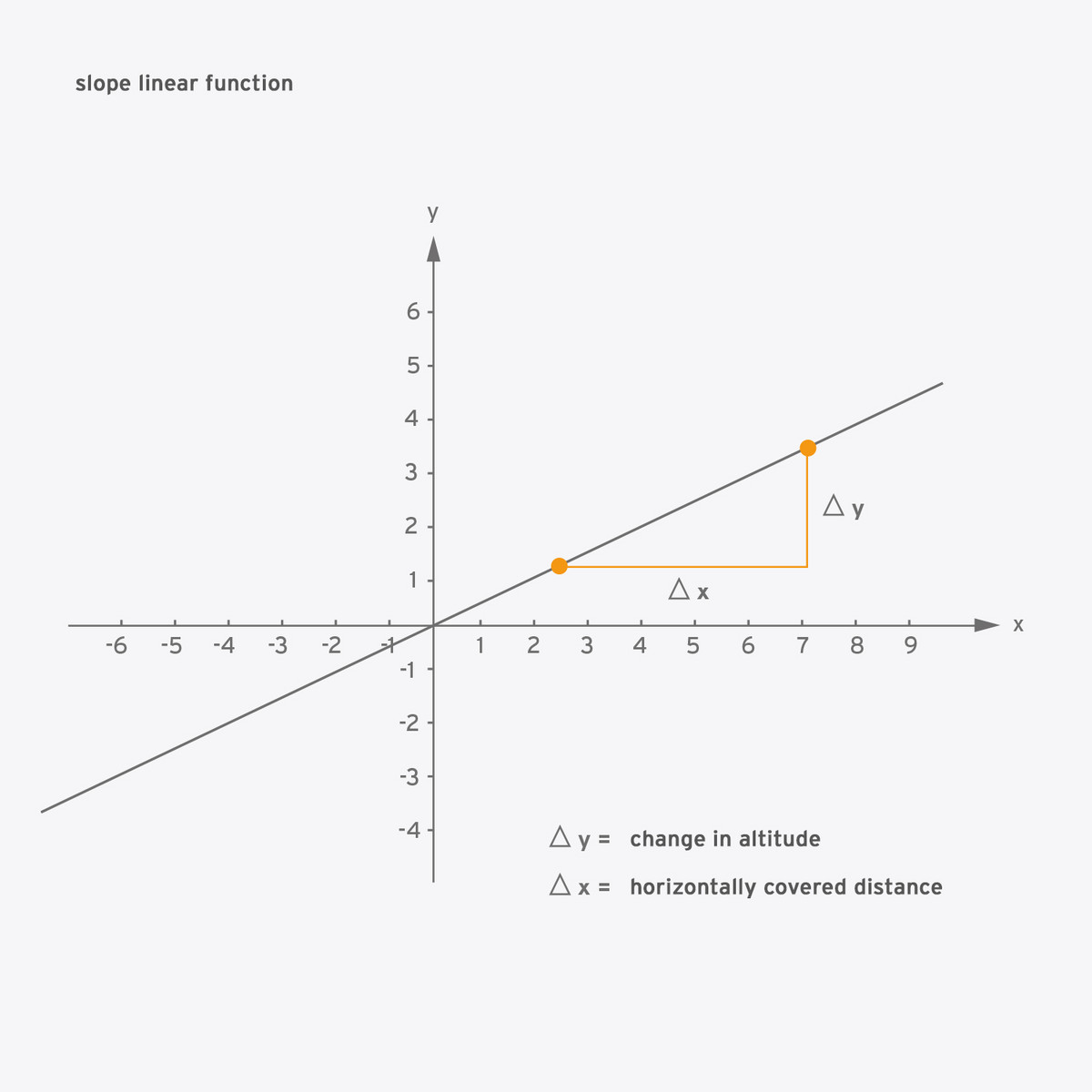
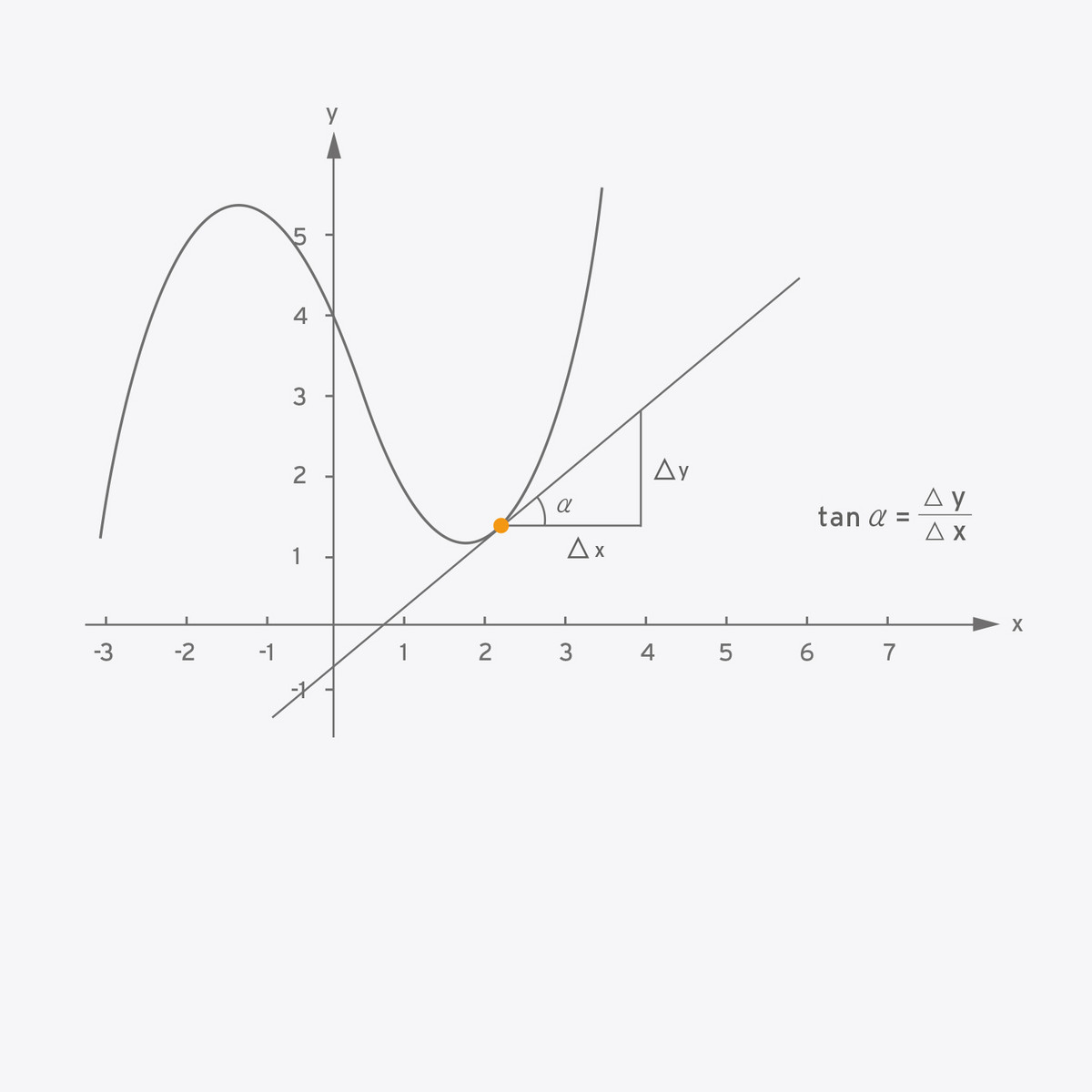
This question can easily be answered with the example of a curve. In short: A curve is an uneven even. In geometry the term curvature describes the change in direction while traversing a curve. But when is this curvature harmonious so that we like to look at it longer? Since our brain likes to reconstruct easily grasped forms, the curvature has to be logical and coherent. A curve is harmonious when it proceeds regularly and does not abruptly change form and direction. Our brain can understand forms better when they have an obvious mathematical background. Therefore, a change in form should be logically comprehensible. The line of a curve, its trajectory is essential in our perception.
In mathematics the slope is the measurement of a curve’s or line‘s slant. What does that mean again? Just imagine standing on a road leading up a hill. You want to reach the top so you have to overcome the slope, with every step forward you will move a bit upwards as well. But the steeper the road the more power you will need to move forward. The ratio between change in altitude and the distance covered horizontally defines the road’s steepness.
If you ask yourself now what the slope of an even has to do with a curve, I have to thank you for your attention. This should simply prove that the slope of an even is constant for the complete length. But this is completely different with a curve; with a curve the slope changes constantly. To stay with this example, imagine once again walking on a road: Sometimes we go up a hill, sometimes down. If the change of slope is regular this seems to be harmonious. Even if you never took an advanced maths course at school, your brain registers the regularity or irregularity of a curved shape. It tries to reconstruct the form and can stomach regular changes far more easily. Complex or irregular slopes are difficult to digest for our brain because they need a lot of time and information to calculate and therefore are unharmonious and unpleasant in the eye of the beholder.
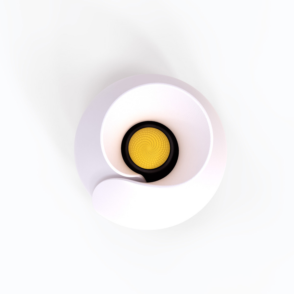
bloomy
The room scent dispenser bloomy seduces. Beauty attracts. The form is that of an opening bud and mirrors the dispenser’s function. The curve formations are regular and smooth creating a harmonious appearance.

Nothing compares to natural beauty.
While bionics primarily studies the technical aspects of nature, bioaesthetics dedicates itself to the aesthetic aspects of nature. Bioaesthetics studies the beauty of natural organisms, their regularity and harmonies – all with the intention of using this insight for developing products. Often enough we have to recognise that we, living on earth, wander through a permanent exhibition of excellent design. And it is not just flowers that serve as a role model for natural aesthetics and design. When taking a closer look we can find extraordinary surprises: The semi-gloss finish and the harmonious curvature of a cockroach’s wings can be an inspiration for industrial design. Curving, surface characters, color combinations or the composition and relationship of a natural organism’s different components are often enough ideal design templates. ‘Beauty‘ means more than ‘beautiful‘ – there are intersections between bioaesthetics and bionics, and the principle ‘form follows function‘ can be found in nature as well. Harmonious proportions not only look but actually work better. Fish, for example, have a very harmonious form that reduces water resistance while swimming and are therefore often used as a model for the design of ships and submarines. Apart from that, a designer can play with the associations that come with natural forms: The sleek form of a shark was the model for the sports car study that the Corvette Mako Shark was based on. The power, speed and agility the viewer associates with a shark are also perceptible in the car‘s design.
Higgs (designed on behalf of Fraunhofer Institute for Integrated Circuits IIS)
Always keep an eye open. The mini camera of the Fraunhofer Institute for Integrated Circuits IIS is intelligent, can detect faces and has other features. Experiences made in bioaesthetics acted as model for this form that can especially be seen in the combination with tripod legs. This makes the camera look very active – constantly working and delivering information.


Colors have a bigger influence than we often think. The moment light hits our eyes it results not only in color perception, but the light spectrum of a color can also trigger certain associations. It is either a result of our personal experiences or presentiments formed and passed on over generations and centuries, anchored in our genes through evolution.
The following short synopsis describes how we receive a certain color and what association it generates.
Red
This color leaves no one cold.
Life, passion and eroticism – all this is united in the color red. But it is as often associated with energy and fire as with fury and aggression. There is a reason we use the term “seeing red” when we are angry.
Blue
A color causes wanderlust.
The color blue first of all seems cool. But in remembrance of a clear blue sky and the width of the sea it is also a color associated with faraway places. Blue reassures and soothes, is clear and dignified. Blue is the color of harmony and gives hope.
Yellow
Looking at this color makes us happy.
Yellow is the color of vitality and joy in life. We know this effect very well, it is the same as the stimulation we get when sunbathing. But yellow stands for the negative feelings of envy and – since it reminds us of gold – greed, too.
Green
This color is quite natural.
Green is the color we meet every day when looking at plants. It is then no wonder that it stands for growth, life, balance and calm. If you get the green light, you get approval to start.
Black
A color that does not really exist.
Vincent van Gogh described black as the ”queen of colors,“ even though from a physicist‘s
perspective black is no color at all. Black surfaces absorb a huge amount of light which make them elegant, classic and exclusive.
White
A symbol for what is good.
In comparison to other colors white (like black) is technically no color at all. Nonetheless white color impressions symbolise purity, light, truth, innocence and perfection.
Silver
The color of modernity.
As a noble metal, silver is always counted as the runner up, second best to gold. But in terms of colors, silver is far better in business. It stands for dynamism, elegance, value and progress.
Gold
The color of splendor.
The sought after noble metal gave the color its name. It is associated with wealth, luxury, and power but also with conservative attitudes and a propensity for extravagance and waste.
Each person has certain colors that fit well with their hair, eyes or skin tone. It is the same with products: Some colors are more favorable to others. Colors shape the character of a product in an essential way: They can for example make it more flashy and noticeable, young, mature, warm, cold, technical, factual, elegant, cheap, classic or futuristic. They can improve the association a certain form intends or create a sharp contrast to it. Even a Ferrari seems tame when painted green instead of Ferrari red.
When choosing a color the place where it will be sold and promoted plays an important role. In Europe, for example, white symbolizes positive characteristics like innocence, cleanliness or wisdom. This is completely different in East Asia or Africa where white is the color of death and grief. A European bride dressed completely in white easily mutates into a grieving widow. Speaking of white: Did you know that bulls cannot actually see the color red? He could not care less if the torero is holding a specifically red cloth in his hand. What really gets to him is the urgent fanning of the cloth, the so-called muleta. In the early days of bullfighting this cloth was white. But because a bullfight is a rather bloody spectacle the cloth was later colored red. That does not make it less problematic but gives the optical illusion of being less bloodthirsty.
Red cloth actually works far better with humans even when it is not being waved around. Red always catches our eyes because it has the highest visible wavelength of electromagnetic radiation. Therefore, it is often used as a signal color, for example on signs, lips or sports cars. A study by the Technical University in Munich proved this: In an experiment they made test subjects listen to the sound of the German express train ICE. On a screen test subjects could see different types of trains passing by. Even though they always heard the same sound and the volume never changed. But when asked, the test subjects declared the red train had been loudest and fastest of them all.
Another example of the fascinating associative power of colors is the success story of jeans. Jeans are inseparably connected with the color blue. When Levi Strauss moved from Franconia in Germany to San Francisco in 1847, his sole intention was to fabricate robust work clothes for gold diggers. The durable cloth he imported from the French town of Nimes he called ‘denim‘ which meant nothing else but ‘from Nimes‘. The indigo dye gave it its trademark blue color. The rest is history – the popularity of jeans spread from country to country like wildfire. Whoever wants to give his or her product the appearance of resilience could borrow from the jeans concept. Blue seems extremely wear-resistant and durable – not only because of jeans but because in the early 20th century nearly all work clothing was dyed blue after BASF used a solution to color fabric with synthetic indigo. Dungarees, tunics or aprons – all over the world many work clothes are still colored blue. Associating the color blue with work is the result of a centuries old historical development.
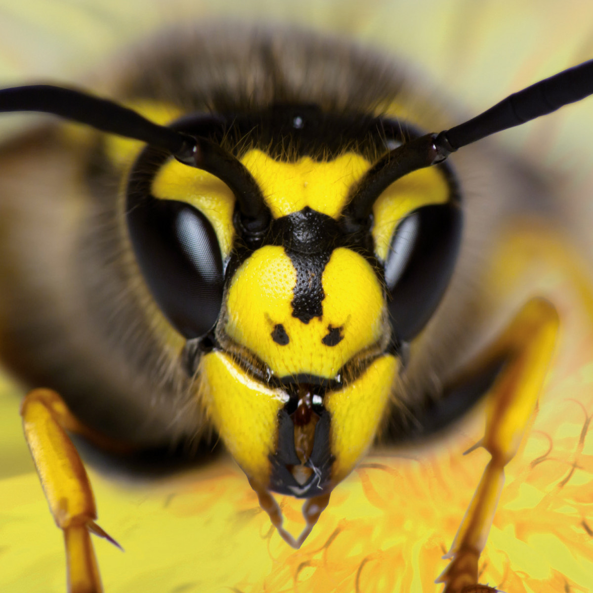
There is another color association that may have been acquired via a painful experience. Be wary of things that are black and yellow - especially when they come in stripes. Whomever an angry wasp has stung might remember why. And there are other dangerous and toxic creatures that use this color combination to discourage potential attackers. No wonder many warning signs take these colors, they caution for example against radioactivity and explosives.


When working with more than one color it is essential that all the colors fit together. This also counts when different product elements have different colors. Even when offering the same product in various colorings is it necessary to fit all the variations together harmoniously. Because if someone displays different color variations of a product – when they are on sale, for example – the nuances should fit together. In the automotive industry the individual coatings of cars are synchronized and co-ordinated to make sure that when the cars are exhibited together they create a harmonious overall picture. But how to achieve a pleasant color coordination? There is more than one method – which I will discuss in the following sections.
Creating a color family
The first step is always to pick a basic color, let us say orange. In the second step one has to create varying nuances of this orange tone that only differentiate in their intensity. The point is to vary the red’s quality and lightness. These color families - like human families - bear a striking resemblance to one another. This is important for creating a figurative entity for products. The best results can be reached by varying the nuances in a consistent gradation, therefore avoiding inconsistency in style.
In harmony with a color tone
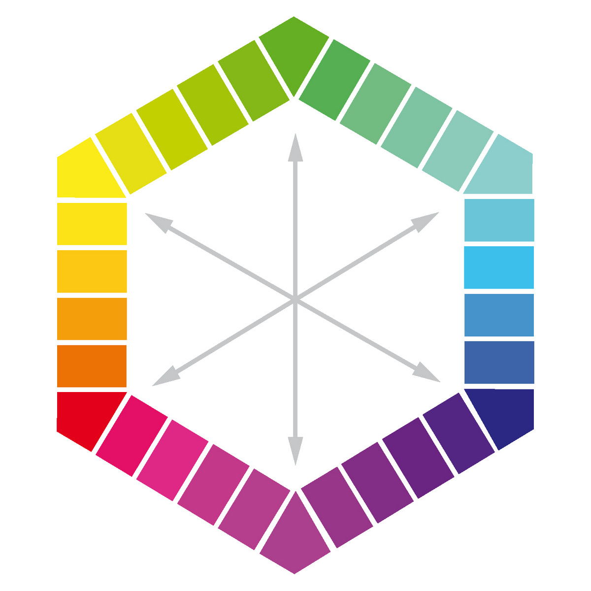
To create a harmonious series of colors from different color families one can look at the color tone for advice. The term color tone can be defined as a mixture of different colors distinguished by an identical lightness and quality. In contrast to color families one first picks the different colors and then starts to adjust them to each other. One example: The two colors red and blue are very different but can have the same color quality. When choosing a color one can use complementary colors like blue and yellow or choose colors lying next to each other on the color wheel like red and orange. When working with more than two colors it is important to keep the distance between them constant. For that the color hexagon can be of assistance.
Complementary Colors
(from the Latin complementum) is a concept in color theory. In color theory one must distinguish between adding and subtracting from a variety of colors. Opposite colors may also be designated as complementary. When a color is mixed with its complementary color, the result is a neutral gray tone. A pair of colors can also become complementary despite not meeting exact technical and physical industry standards (i.e. RGB, CMYK).

An inexhaustible fountain of inspiration
What is the similarity between an Indian tiger, an Australian coral reef and a German meadow? The creator. All of them were made by nature, and when it comes to colors, nature is anything but mean. Looking for color inspiration one only needs to walk around open-eyed. Strolls through the park, a picnic on a meadow – everywhere there are colors that work quite well together. The usage of colors found in nature leads not only to beautiful combinations, but these colors are perceived as authentic as well – simply because they are the most natural in the world.
How shiny is a material? How does it feel when touched? Both questions play an important role in industrial design. There is a simple procedure to define the surfaces of materials quite easily.
• Coating with lacquer, colors, rubber painting, etc.
• Chemical treatment for example with electrolysis
• Physical treatment like polishing, sandblasting, brushing
To shape surfaces in an aesthetic and haptic way there are two points to consider:
It is important for a refinement to be long-lasting. One example: A sandblasted surface can have an inhomogeneous shine due to friction and wear. The same goes for electrolyzed refined surfaces that wear down through mechanical abrasion. Every item that is exposed to mechanical strain like screws, tools or gym equipment has to be fabricated well enough to be durable for a very long time.
A surface should not pretend to be something else. Often enough plastic is coated with a metallic coating but one touch tells us what it truly is. The product seems fake and inauthentic. Eventually after the coating has been scraped away and the plastic emerges the once pleasing effect seems cheap and disappointing. Worse still are wood or leather imitations. When using a material one should be confident about the choice and not hide it behind something else.
Laying false trails
We cannot always trust our own eyes. And I am not just talking about after that second glass of wine, but every time. The wide field of optical illusions proves that what we think we see and what is actually there are often enough two completely different pairs of shoes. This astounding effect can either lead to an identity crisis or else one could use the effect to make products better. Optical illusions are known from all areas of visual perception. There are for example: Illusions of depth, color illusions, geometrical illusions or movement illusions. How does it work? To put it again more simply: Our brain likes to have prejudices to simplify our life. When reconstructing pictures this leads to a rather basic analysis of the received parameters, in order to put the perceived information into one of the brain‘s labelled drawers. This principle functions well and makes sense in our everyday life, but the disadvantage is that these prejudices – like in real life – are not always true.
Square
The mobile drive Square fulfils every requirement one might have for a high-quality, mobile hard drive. Due to its curved surface on the top and below it appears rather slim and the high-grade steel platters protect it from scratches. The streak made of synthetic material protects the hard drive from a potential impact if someone drops it.
Art and design are close relatives, but at the same time they are very different. Industrial design has so many rules and guidelines that completely disagree with the principles of art.
Art lives to be free and break rules. Even though there is the Latin dictum: lege artis ”according to the rules of art“ they do not exist. Art is free while design is not.
This should not sadden the industrial designer: In fact he or she should feel even more encouraged to be creative. The biggest challenge is to use even the smallest stage to
escape pragmatism.
Just look at nature again. On the one hand everything is thought through, things function well and complement each other perfectly. It is an incredible overall system. On the other hand we have to be honest: Whoever once designed nature could have been far more pragmatic and boring. An artist’s streak even exists in nature.
An interesting and yet most complicated point is that this streak can only be analyzed a little –or not at all. One thing is certain: Every design is also the very personal handprint of a designer. A designer, metaphorically speaking, always puts a part of his soul into the draft. It is this little extra that makes the difference when a customer chooses a product that has the same function as others but is designed slightly differently. People feel and cherish the enthusiasm a designer invests in a product. Even though when asked they often cannot describe in words why they chose one product over another. The artist’s streak can be found between the lines.
What is essential for an artistic note:
• Courage for creative chaos
• Joy in positive provocation
• Ability to break with conventional thinking
Playfulness makes a product exceptional and gives it character. It makes it likeable and helps it stick out from the masses Just think about it: We often love other people not despite but because of their rough edges and flaws.
As always: Do not exaggerate! Otherwise art turns into kitsch. Genius and insanity lie famously close together.
The texts are excerpts from the book "360° Industrial Design" by the author Arman Emami, published 2014, niggli Verlag